Prisma Cannabis
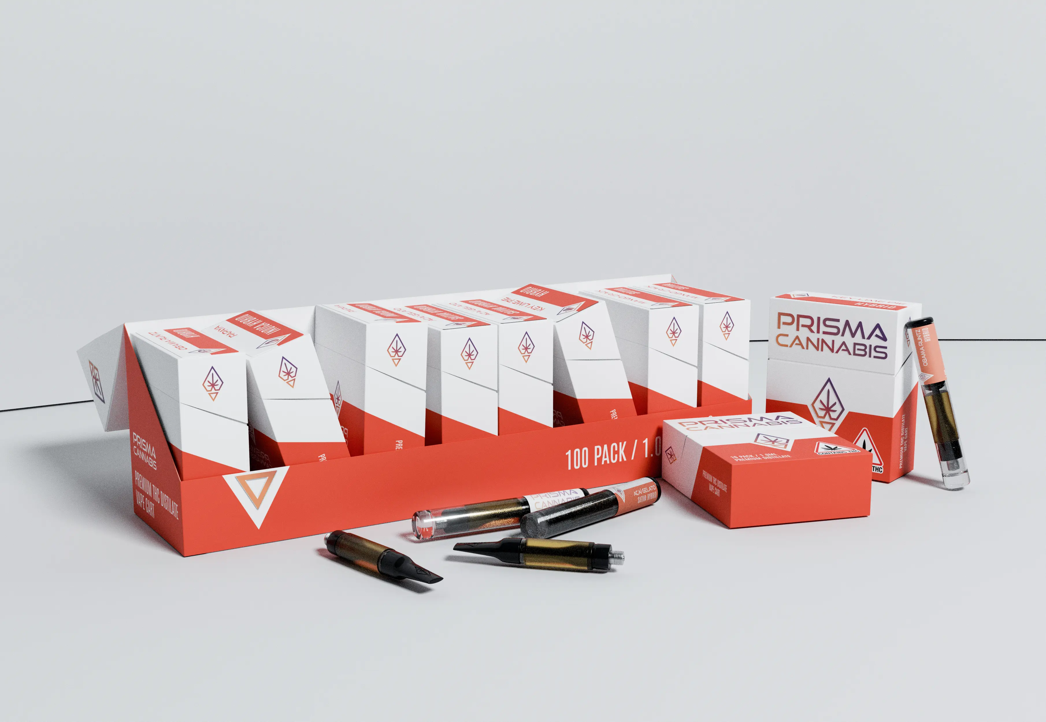
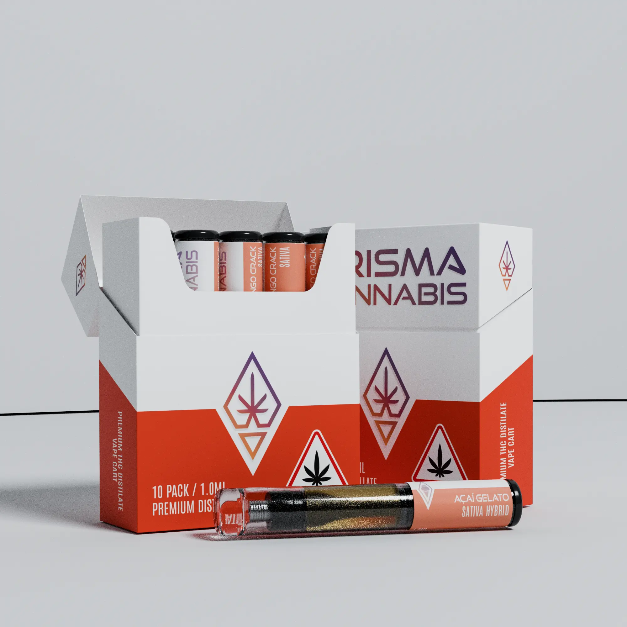
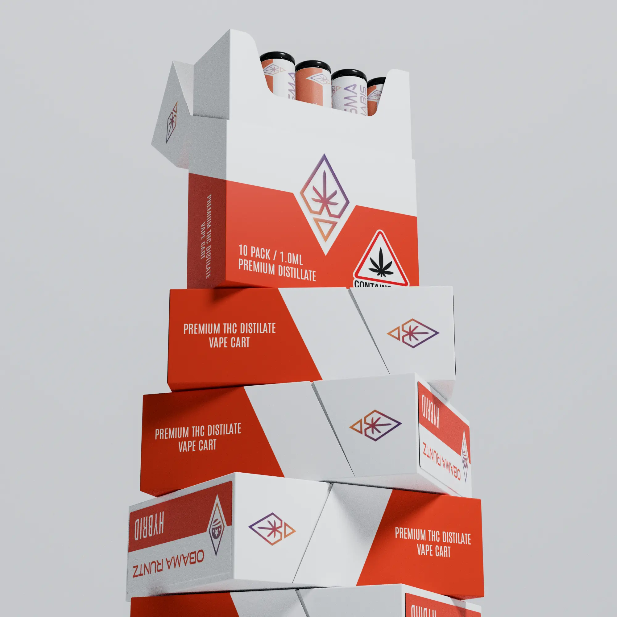
Prisma Cannabis reached out to me to create a unified brand identity and packaging design. They wanted a logo that reflects the geometric shape of a prism, using bold colors. The challenge was to balance these vibrant elements with a sleek and minimalist packaging style, ensuring the product remains premium yet visually striking and easily recognizable.
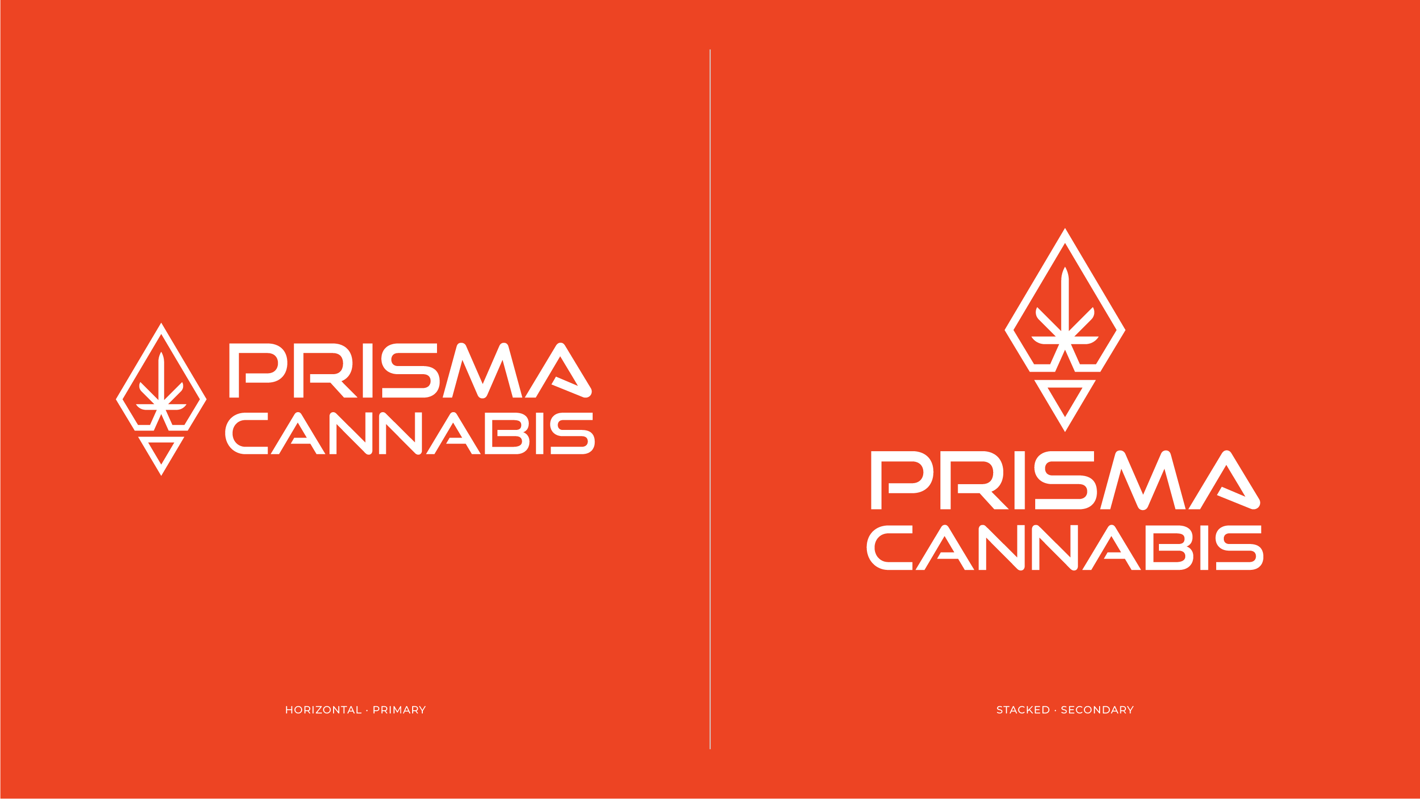
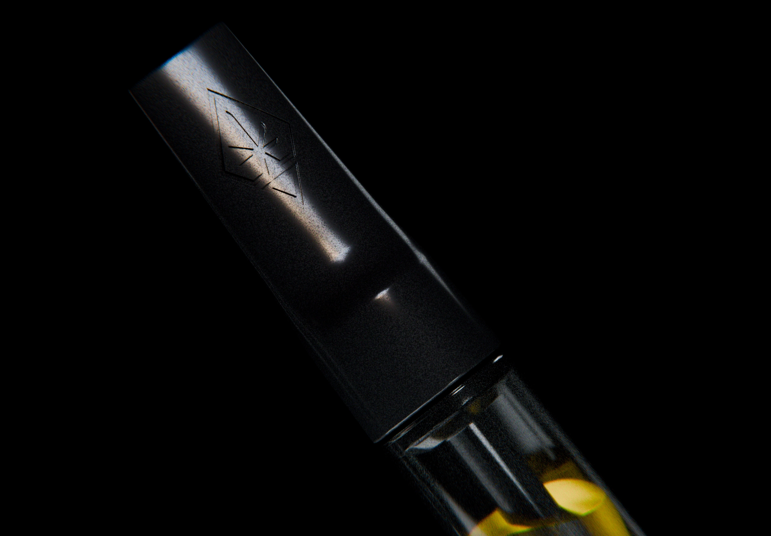
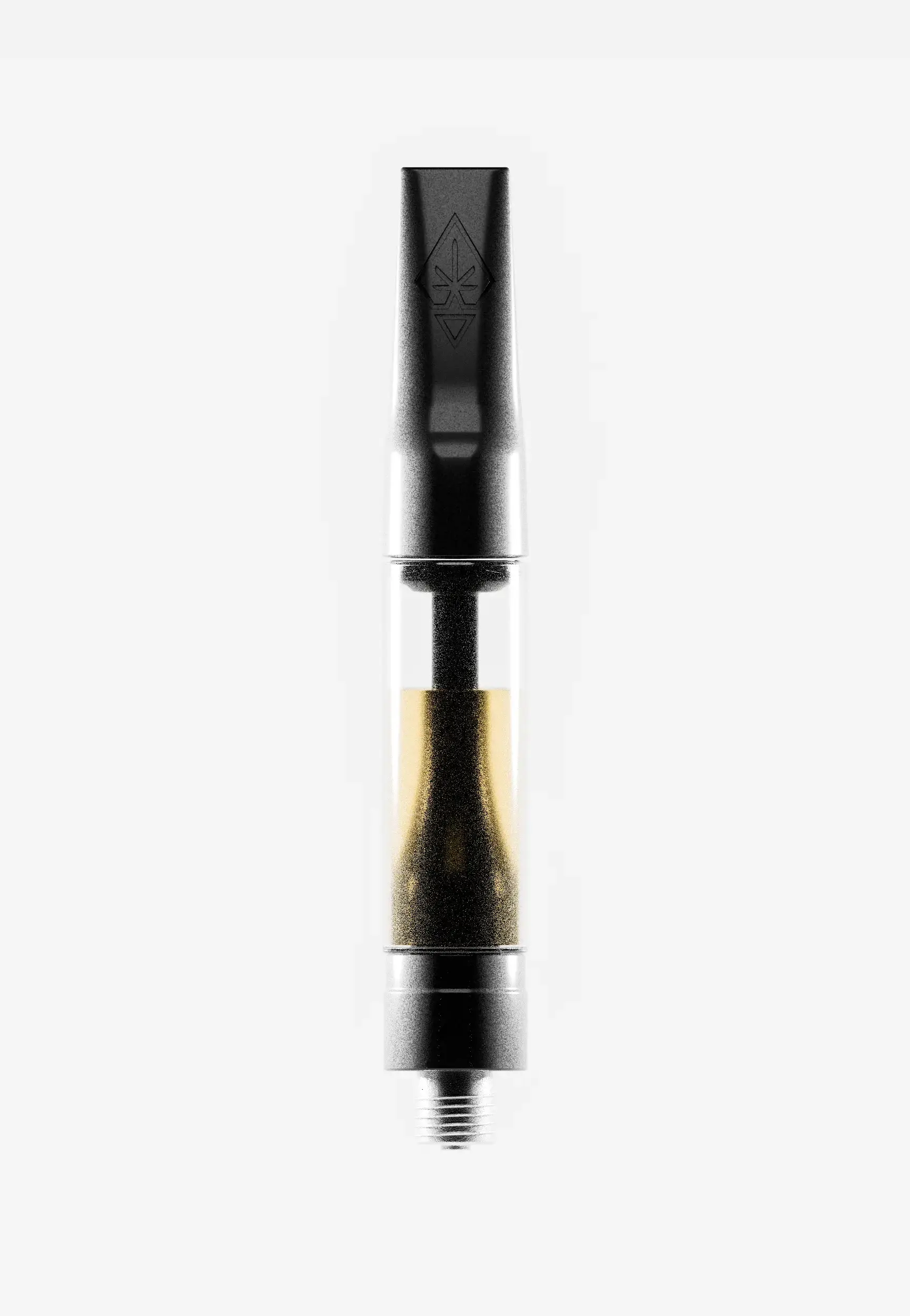
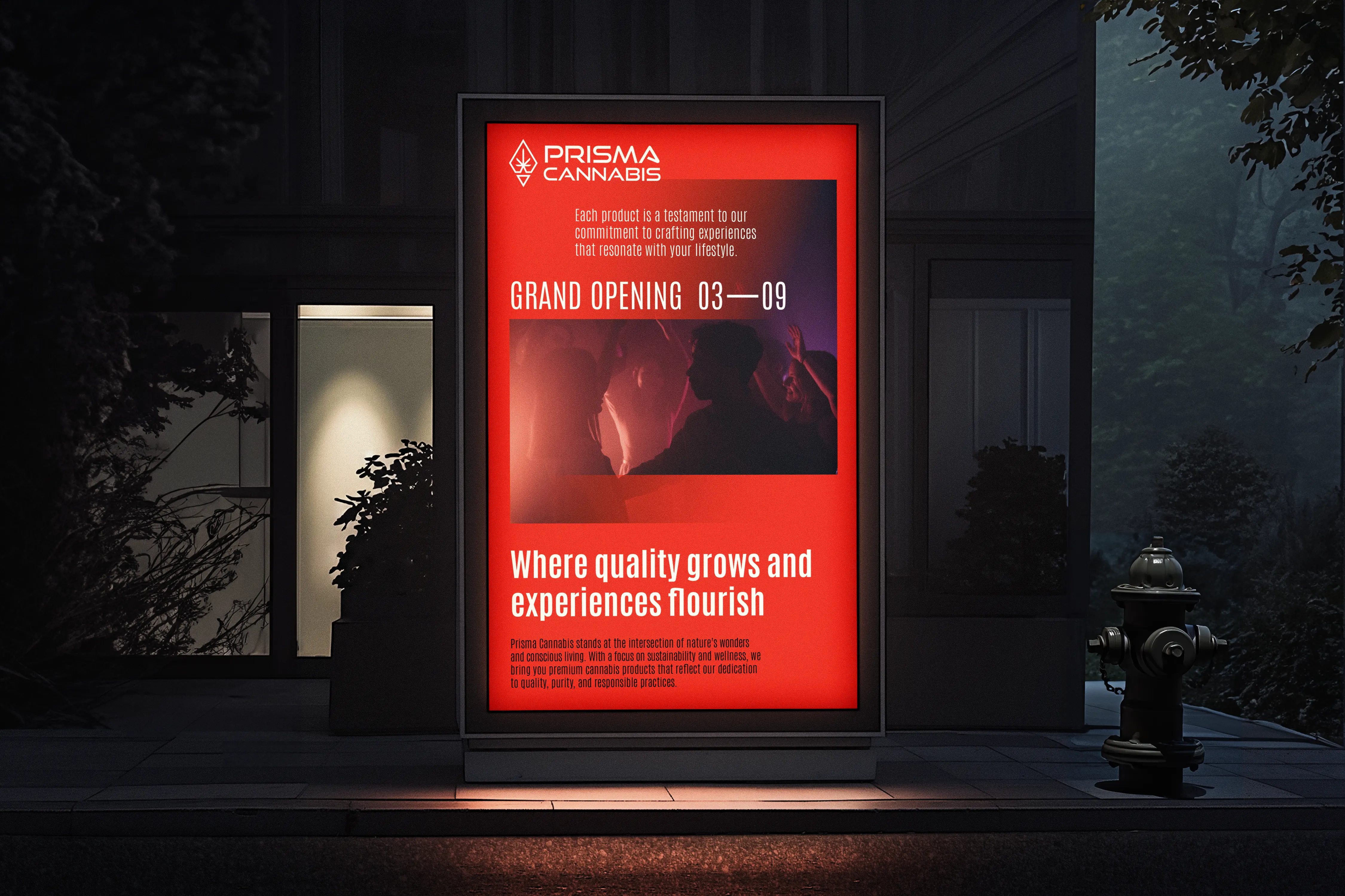
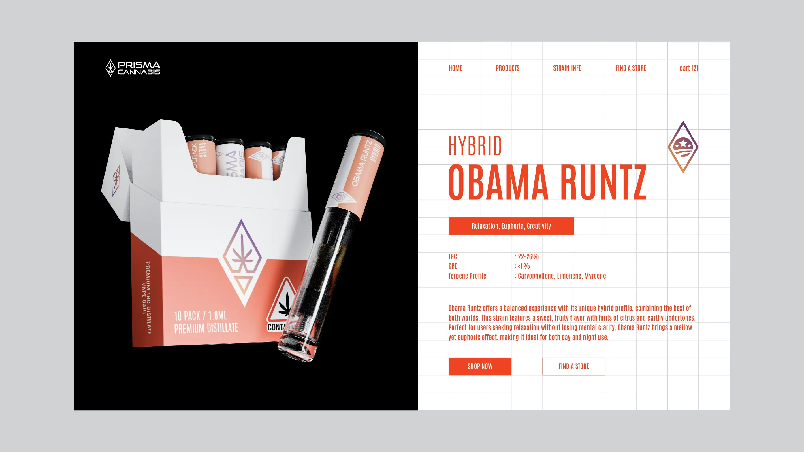
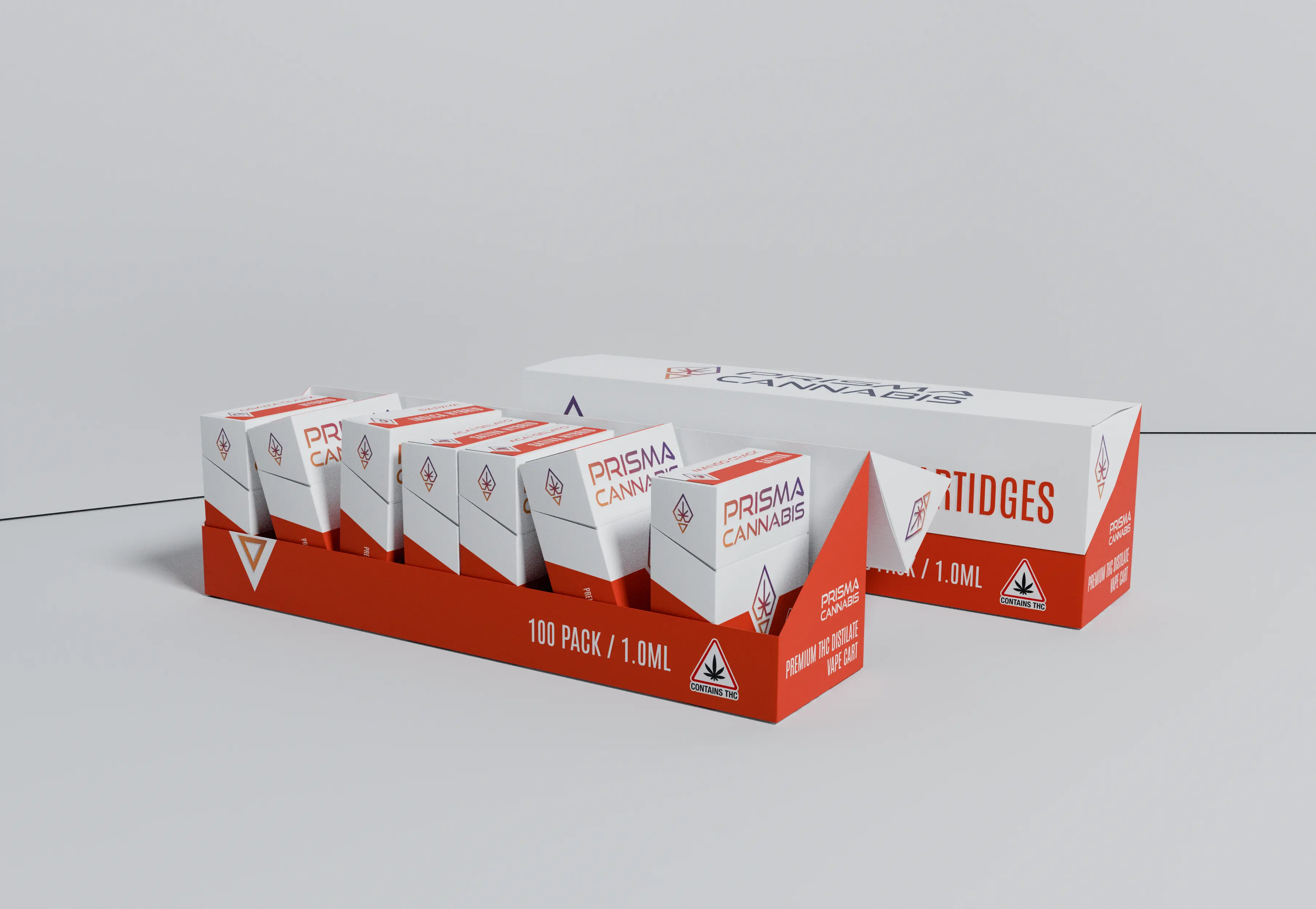
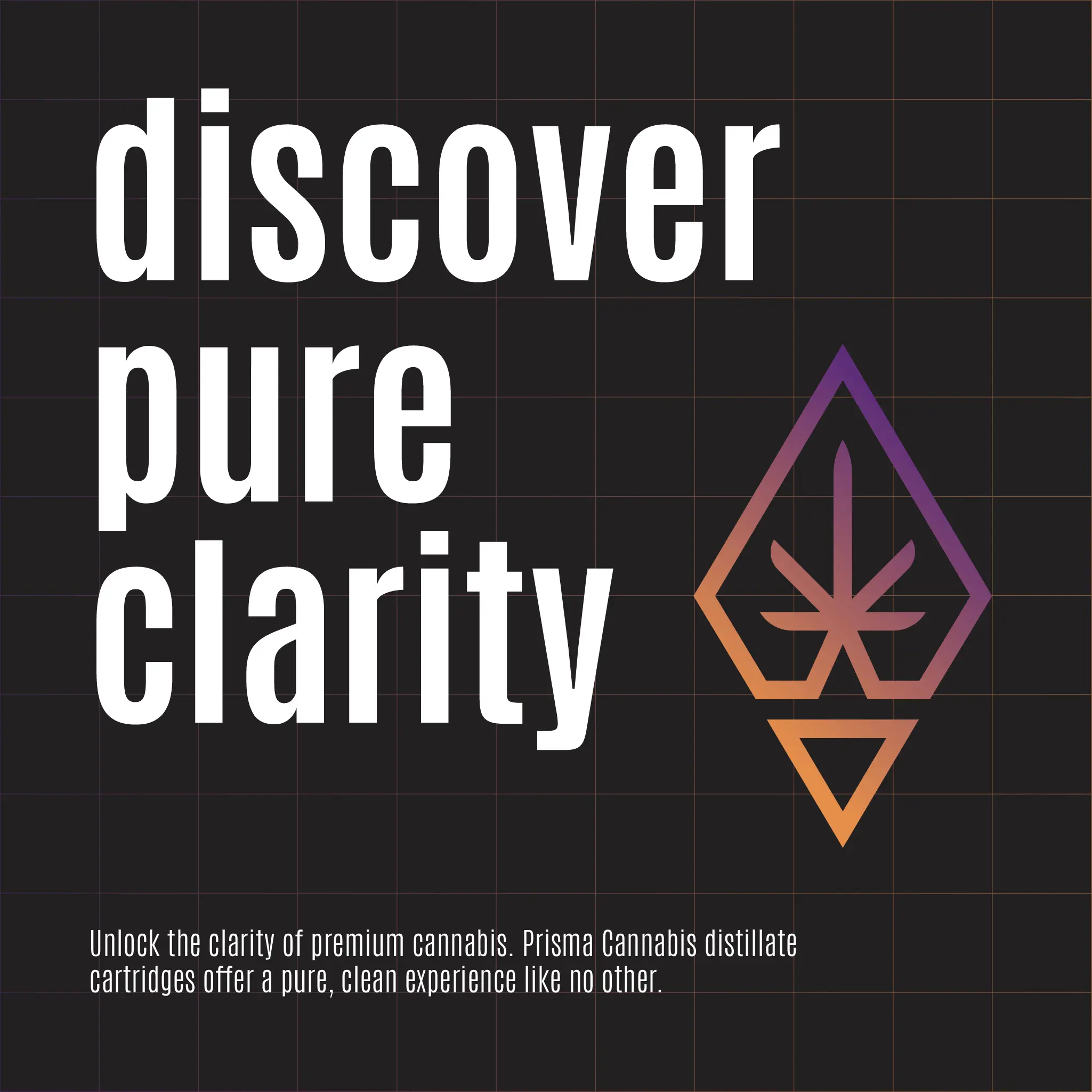
I designed a logo inspired by the prism concept, symbolizing the bending of colorful light. It features sharp angles that convey precision and clarity. At its center, a cannabis leaf is integrated, subtly reinforcing the brand’s identity. This combination creates a memorable visual that effectively communicates the brand’s essence.
For the packaging, I focused on a clean and minimalist look, ensuring readability of all text. I selected bright colors for strong contrast with competitors on the shelves, making the product pop. The logo was prominently displayed to boost brand recognition, which is crucial for establishing a new name in a competitive market.


More work